Thinking of updating but don't have the time or budget to gut it and start over? There are so many solutions that will make your room feel fresh and updated that doesn't involve ripping out drywall. This also means less dust, which is also a bonus. Take for example this boring, builder's beige of a bathroom (no offence to my favourite contractors, but you shouldn't be in charge of aesthetic decisions - that's just the way it is). This bathroom screamed "basic model, no upgrades" of the previous homeowners, which didn't suit my vibrant and stylish clients.

Original Basic Tub Surround
They had just been through two big renovations (see their beautiful kitchen here) and didn't want the headache of a big reno. Plus, the floor and shower tile was still in great shape, it was just too beige for my client, so demolishing it would have been frivolous and wasteful. My suggestion was to replace the bathtub tile only with a proper stone tub surround and panelling detail. Another issue was the lack of storage - everything sat on the tub ledge which looked temporary and cluttered. My solution was to add built-ins to one side that sat atop the new stone tub deck. Not only did it add much needed storage, but it warmed up the bathtub area. Throw in a little white subway tile and it's a whole new look!
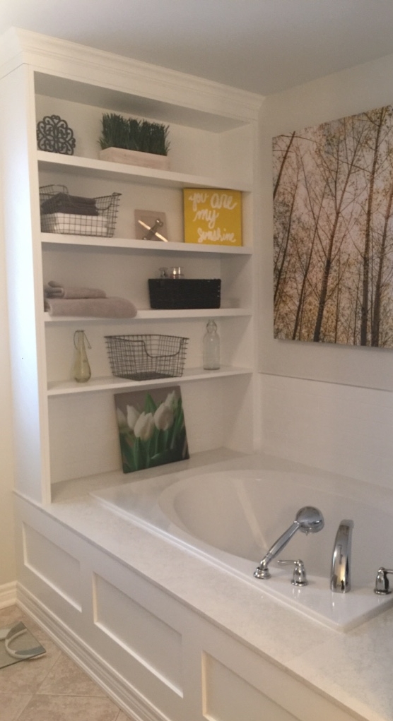
New tub surround, panelling and built-in shelves
Previously it was so empty and cold feeling - who wants to bathe in that environment? Now it is cozy with loads of visual interest. We added a new grey vanity and Voila! a whole new vibe. And all without ripping out a single wall - or floor or shower tile! If you need help with something like this, feel free to contact me for a consultation - I'd love to hear from you!